Susan's Designs » Drapery & Home Decorating

Masthead header
Susan's Designs bio picture
  • nesting creatively

    Welcome to my showcase of design ideas and inspiration for custom home décor, flattering window treatments and other soft furnishings. I have been blessed by being invited into many beautiful homes and meeting the nicest people. I am among the fortunate few who truly enjoy a fulfilling and rewarding profession. Thank you for looking at my work.

The floral pattern of this bell box pleated valance adds the perfect splash of color to the kitchen. The style is tailored; by the box pleats at the top of the valance, yet soft and elegant by the bell shape formed at the bottom of the valance. When windows fall on both sides of a corner, it is best to treat the window as a whole when choosing window treatments. This valance continues around the corner without leaving any space, making the window appear larger.  The colors from the floral pattern are accented in the fabric on the bench seat cushion, table runner and pillows. Making the kitchen bloom with color.

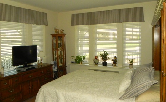
Mixing fabrics in a room is a difficult task for most do-it-yourself decorators. To give yourself a professionally decorated look, these are some helpful hints. You will need to consider six different rules, all relating to the fabric choices. Pattern type, scale, proportion, number of patterns, pattern colors and texture. The best pattern type in a room is an ideal mix of varying patterns, as shown on this bed, where a variety of stripes, diamond pattern,  medallion and a large motif are combined. Pattern scale is the size of the patterns motif or design. You must vary the scale of the patterns in the room, varying from small, medium to large. Proportion relates to how often the fabric is used in the same room. You should not have an equal mix but of larger proportion of one fabric, in this instance the main Asian influenced fabric on the quilt and main pillow shams. Then you should use a small proportion of another, the larger stripe and diamond pattern used on the back Euro pillows and dust ruffle. Followed by an even smaller use of additional fabrics, shown in the diamond tailored pillow shams, the accent small striped rectangular pillow and the round bolster pillow.

The number of patterns that can be used in the the room is almost endless, as is represented in this photo by incorporating the carpeting and the bench. Pattern color is important as you do not want to make the visual look become dizzy to the eye. You should use the same color scheme or a shared palette of colors throughout the fabric combination in the room. Finally, texture is also key to your success. Texture is often used in your solid fabric choice but can be in your patterns as well, perhaps a quilted pattern, flat woven, silk, or even a chenille will fulfill your needs. Following these simple tricks will lead you to a professionally decorated room.

A cleaver way to use coordinating fabrics in a room is by choosing a window treatment that incorporates more than one fabric.  A box pleat valance does just that. This box pleat valance is made with two fabrics, the main floral fabric on the front of the valance and then the contrasting diamond  fabric on the inside of the box pleats. The corners of the pleat are then buttoned back to allow the complementary fabric to peek through. Creating a perfect topper for any window style. The kitchen door wall in this same room uses tab top drapery panels for function with visual appeal. The contrasting fabric from the kitchen window was the perfect fabric choice for the drapery panels, modern and elegant allowing the panels to become timeless in style.

Roman valances create a contemporary addition to windows, offering a uncomplicated style that accents with simplicity. The clean lines of a Roman valance work well in any room.  This style, although very tailored and pleated,  adds a softness and suppleness to a room’s hard edges, in this case the 2″ horizontal wood blinds. Fabric choices for a Roman valance are endless, they work well in a variety of colors, prints and textures.  This room showcases how a simple design and color palette can make a room stylish. The cream color shade accents the blinds and crown moulding without making the window look busy. The black ties pull in the color from the tile used in the shower and give the Roman shade and the room a cohesive look.

London shades look a bit like a balloon shade, but are much more tailored.  The London shade and balloon shade share similar properties, like shirring and a puffed look when the London shade is raised. The largest difference is in the the top of the London shade, which is pleated and tailored giving the shade a refined look. Strings attached behind the shade allow it to be vertically raised and lowered, offering privacy when needed. The London shade is a perfect window treatment for powder rooms, bathrooms, bedrooms and dining rooms. This style of shade not only offers practicality but beauty to the room. Fabric choice for a London shade can be a print, solid and even a stripe or plaid. This London shade uses a pattern that compliments the artwork and warm room color. A dramatic effect is given to the London shade by trimming it in beaded tassel fringe, in the same warm tones as the fabric, giving a small room an impressive look.

Related Posts Plugin for WordPress, Blogger...