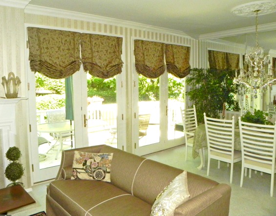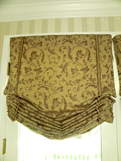

A soft roman shade or should I say multiples of them make up these window treatments. Without adding any color, we added pattern, texture and volume to the windows


|
A soft roman shade or should I say multiples of them make up these window treatments. Without adding any color, we added pattern, texture and volume to the windows
Three separate windows, three separate sizes, one uniformed style. This floral pattern with a pop of red in it was just what this kitchen needed. We kept the style simple to show off the floral pattern with just a kick pleat in the corners. A curved bottom hem allows more light to come in. In the bay window, with three windows we did a triple window treatment, on the larger double kitchen window we did a double treatment and over the sink we did a single treatment. In the bay window we hung the pleated valance right up at the soffit eliminating any gaps there might be giving it a clean, uncluttered look.
A Sheffield valance is such a classic window treatment – tailored yet lovely soft lines. In this lake house we used a bold rather large print in gorgeous bold shades. Notice how each section of the Sheffield has the same large floral pattern – this is where the custom look comes in. To achieve this look seams are hidden in each pleat. The valance is trimmed out in a rich rusty/chocolate silk blend outlining it both top and bottom. The contest peeks out on the returns as well. The length of the Sheffield covers the 2 faux wood shade when it’s pulled up all the way exposing the beautiful lake views. The shades can then be pulled down when sun control or privacy is needed.
Over the kitchen sink the same fabrics were used but a different style was incorporated into the room. Here we created a Stagecoach valance. This is a stationary window treatment with the 2″ faux wood shades hidden underneath and lowered when privacy is needed.
In this room my client had a series of door walls that were 7′ tall and a flank of windows that were 8.5′ tall all within inches of each other. Our solution – build a cornice over the door walls. In this case we designed it to fit around the corner and leave no gap between them. The homeowner already had vertical blinds on the doors for sun control and privacy so we softened them up with some stationary panels to hide them by day. Coordinating drapery panels were hung on the windows unifying the height of both treatments. The contrast fabric from the drapery panels was used to add ties to the cornice boards adding visual interest to the treatment. A similar, but smaller cornice was also used over the kitchen sink. As a finished touch a runner was made for the kitchen table as well as some coordinating throw pillows for the sofa.
|
|
by Susan Dorbeck